CSS::Box-Shadow Add life to your website

CSS box-shadow: is one of the best CSS styling properties which adds life to your website.
But if you add linear-gradient() it will be like adding extra sweet 🧁🍧 if it makes sense 😁
If you are not familiar with CSS box-shadow, I have briefly explained it ahead
CSS Box-shadow
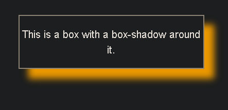
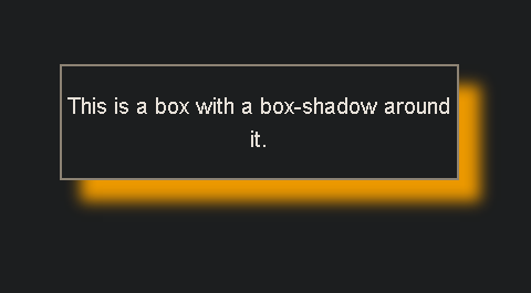
CSS box-shadow helps us to add shadow effect around the box or element-frame, you can add multiple effects by separating them with commas.
box-shadow: apx bpx cpx dpx #colour;
             I    II  III  IV    V
The value a,b,c,d are in pixel.
Now let's learn the box-shadow step by step
I
👉 Here the First value is the offset-x value it specifies the horizontal distance.
Code used - box-shadow: 60px 0px teal;
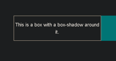
If the value is negative it gives the horizontal distance from left
-- box-shadow: -60px 0px teal;
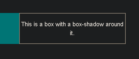
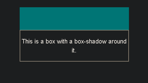
II
👉 The second value as you think 🧠 is the offset-y value it specifies the vertical distance at the bottom of the frame
-- box-shadow: 0px 60px teal;
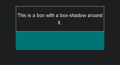
If the value is negative it gives the vertical distance from the top
-- box-shadow: 0px -60px teal;
III
👉 The third value is blur radius as no shadow is perfect and this adds much value and life if used 😍
--box-shadow: 15px 15px 10px orange;
Hmm 👌 now this is going the right way 🤑
IV
👉 The fourth value is the spread radius as the name give the clue it will increase the length and the breadth of offset x,y given.
--box-shadow: 15px 15px 10px 10px orange;
The fourth value is change from 0px 👉 10px 👉20px 👉30px 👉40px
V
👉 The fifth value is the background color, you can choose whatever suits you.
What If...
You want more than one shadow as if the light 💡 source is on the top or under the box CSS can easily do that with help of commas ', '. This simple layering technique gives us more control over the rendering of shadows, and with it, we can fine-tune sharpness, distance, and spread.
One more property that comes is
inset if not specified the shadow is assumed to be a drop shadow (as if the box were raised above the content)
Inset shadows are drawn inside the border (even transparent ones), above the background, but below content.
//First Box:
box-shadow: 0 14px 28px rgba(0,0,0,0.25),
                   0 10px 10px rgba(0,0,0,0.22);
//Second Box:
 box-shadow: inset 0 14px 28px rgba(0,0,0,0.25),
                   0 10px 10px rgba(0,0,0,0.22);
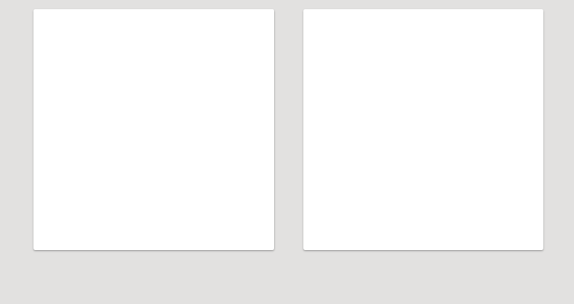
Above 👆 the first box has not given inset and the second is given inset property...
These were most of the cool things you can do with CSS box-shadow 😀
If you are interested in more you can visit - MDN: Box Shadow
See you soon 👋
My LinkedIn Profile - Anmol Verma
My GitHub Profile - AnmolVerma404
My Twitter - @AnmolVe97231707


